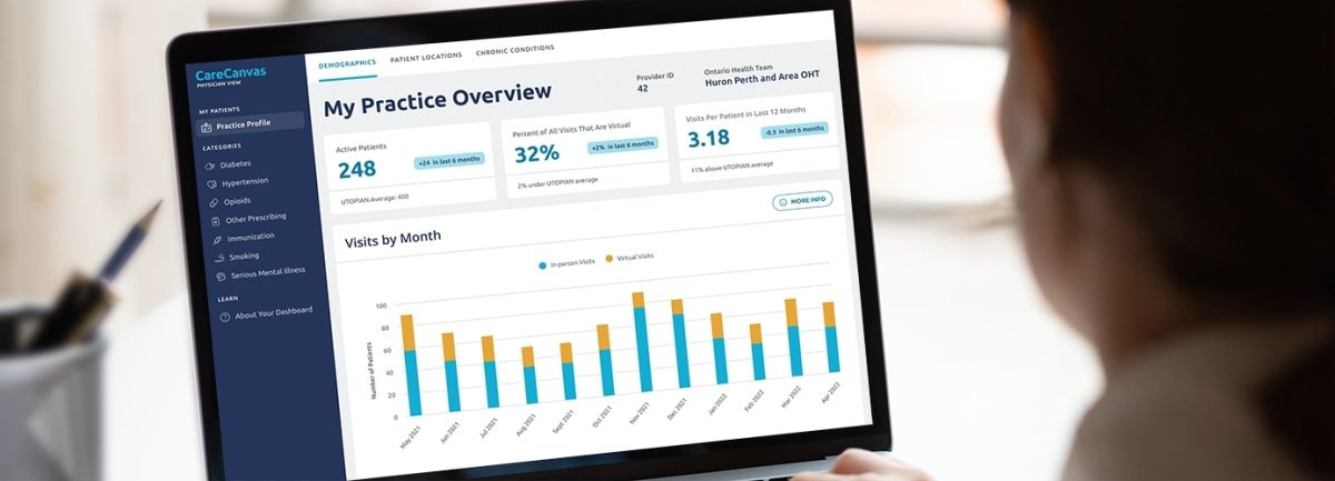
A dashboard for family physicians to identify gaps in patient care
The Quality and Innovation Program of the Department of Family and Community Medicine (DFCM) at the University of Toronto developed a prototype web-based dashboard that leveraged de-identified patient data with the goal of helping family physicians in Ontario to identify gaps in care.


- Client
- The University of Toronto
- Sector
- Health
- Focus
- Website Design, Brand Design, Apps & Software
Challenge
Though DFCM already had a functional prototype, the organization wanted to improve on their dashboard's user experience. They also wanted to implement additional functionality based on recommendations from research that they had previously conducted. Their goal with this project was to increase the likelihood that physicians would use the dashboard and act on their data.
DFCM also had a need to present the data at three different levels: a physician-level view that would support individual doctors, a clinic-level view that would help clinic administrators make informed decisions as well as aid in their mandatory reporting requirements, and an Ontario Health Team view, that could help identify patient care gaps across an entire region.
Solution
As part of the Discovery phase, we conducted a persona generation session with family physicians where they articulated some of the barriers to adoption that their colleagues might face. This included things like skepticism about the usefulness of the platform and of the data, a lack of time to actually engage with the tool, and the possible sensitivity physicians might have to being compared to their peers. In addition, they identified that physicians‘ comfort in interpreting graphs varies, so any data visualization would need to be very easy to understand.
With this in mind, we identified the tasks that each persona would need to perform to meet their needs as well as what messaging they might need to assuage their worries, answer common questions, and increase the likelihood of them using the tool. This formed the basis for our information architecture.
From there we created wireframes and visual UI. This included the design of a flexible graph component that could be used across the three dashboards and the many types of visualizations needed to communicate the data. These had the ability to display contextual information about the graph including where the data was drawn from, limitations of the available data or how the data should be interpreted. Each dashboard was designed in such a way that new indicators and graphs could be added as needed.
We also developed a brand for the tool, which included a new name (CareCanvas), word marks for each of the three dashboards, and a colour palette.
Impact
CareCanvas launched in November of 2022 and is in use by family physicians who are a contributors to the University of Toronto Practice-Based Research Network with plans to expand to more physicians across Ontario in 2023.
Thank you to the Pivot team for the incredible collaboration to get CareCanvas in place. We are very pleased with the end result and appreciate the team's expertise and process.
More Work
View all case studies
How a service design approach revealed new ways to reach Ontario’s most underserved