A new brand identity and web presence for a growing family of brands
NeuPath Health is Canadas largest network of multidisciplinary acute and chronic pain clinics, delivering category-leading treatment and a blended care model combining in-person visits with virtual care. As the company was expanding its footprint through the acquisition of pain clinics and virtual care technology, it needed to consolidate its websites and develop a new identity to bring all businesses into alignment as one cohesive family of brands.

- Client
- NeuPath Health, Inc.
- Sector
- Health
- Focus
- Website Design, Brand Design, Video
Challenge
PIVOT was simultaneously working on the design of NeuPath's proprietary patient-facing app, myBeam, involving an extensive discovery phase of learning about chronic pain, patients, care providers and the goals of the organization. Out of this, a visual look and feel for the app had been developed that the new NeuPath identity would need to be aligned with – but be distinct from – representing both NeuPath’s patient-facing clinic brands and their corporate and B2B brands.
Along with the new identity, NeuPath required a new website that would consolidate five separate sites into one, addressing distinct user groups with very different priorities – including patients, investors, B2B services, and healthcare providers. An added challenge was integrating the acquired businesses that would now be adopting the new logo, without causing confusion for their existing clientele. Recently acquired HealthPointe Medical Centres in Alberta, for example, had a strong brand presence and client base with a robust website that would now be integrated with NeuPath’s.
Solution
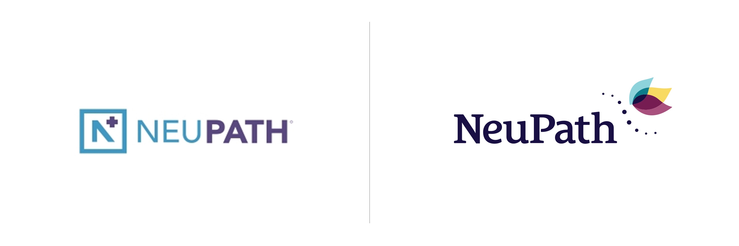
The logo was designed to move away from their previous corporate logo to something evoking a more inviting, “wellness” feel, with an abstracted hummingbird symbolizing the feelings of positivity, lightness, and independence to which their patients aspire. The shared logo graphic and typeface visually connect the parent brand with all eight sub-brands as one cohesive family.
This visual connection between the NeuPath brands became all the more critical as we developed the new website, which contains four sub-sites to address the key user groups we had identified: patients, healthcare providers, investors and corporate businesses. The branding scheme became the thread that ties the four areas together as one cohesive website. Within the patient area of the site, because services differ between their Eastern and Western Canada locations, geolocation identifies where the user is located and serves up content most relevant to them.
To support the need for educational material for both patients and providers, an animated video was created to introduce the condition known as chronic pain in an accessible, optimistic manner. The audience follows an individual on a metaphorical journey as he learns about the biological, psychological and social driving factors behind chronic pain, the idea of a comprehensive care team, and the importance of self-management.
Impact
NeuPath Health, Inc. now has a cohesive family of brands living under one roof on their new website, where features have been developed to address barriers to care learned about in our Discovery phase. Patients can now complete a self-assessment on the site and book an appointment without a referral from their doctor. The site provides educational resources for referring physicians around the diagnosis and care of chronic pain patients, addressing an identified gap in understanding and increasing quality of care in the community.
PIVOT has an ongoing relationship with NeuPath and continues to roll out new features and content on the site as they become available.
More Work
View all case studies
How a service design approach revealed new ways to reach Ontario’s most underserved