Brand identity, digital presence and launch strategy for a rural research institute
The newly formed Brightshores Research Institute needed to establish a brand and digital presence and develop a communication strategy to promote their work in rural healthcare innovation.

- Client
- Brightshores Research Institute
- Sector
- Education & Institution, Health
- Focus
- Website Design, Brand Design
Challenge
Brightshores Research Institute (BRI) partnered with Pivot to support its strategic evolution, transitioning from an entity within a larger hospital system to an independent non-profit with a distinct brand and clear positioning. This strategic transition was a commitment to advancing healthcare solutions to meet the unique needs of rural communities.
Pivot was brought on board to develop a cohesive and memorable brand, digital presence, and communications strategy that positions the organization as an innovative force in rural health — one that challenges the status quo and has the credibility, experience, and network to be taken seriously across the broader healthcare research landscape.
Process
The project began with a series of work sessions to understand the organization's goals, its position in the rural health research landscape, the ecosystem of the Grey Bruce Region where it is located, and its audience and stakeholders. Additionally, our team held more extensive work sessions and one-on-one interviews to understand people, motivations, and scenarios that would influence interactions with the organization.
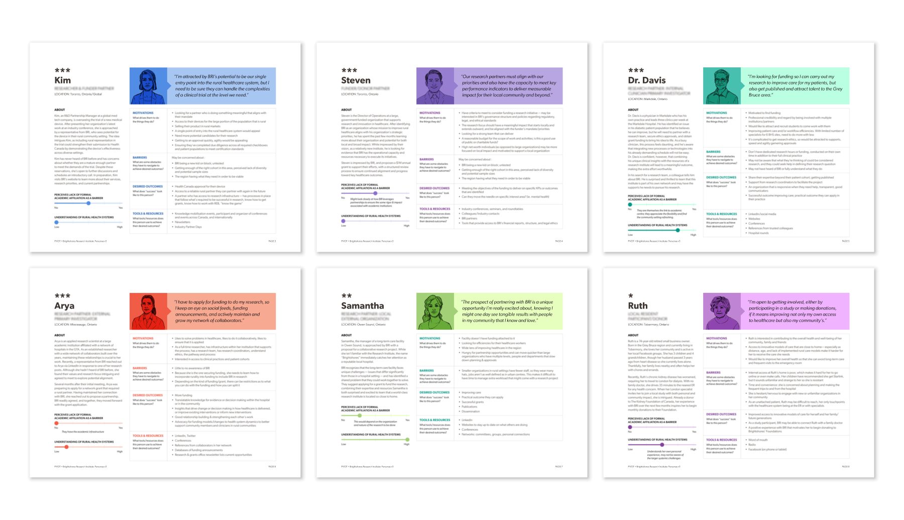
Coinciding with understanding people and systems, we conducted brand audits and work sessions with the core team, stakeholders, community partners, advisors and board members. The output of these sessions shaped a brand strategy that would guide all subsequent design and communication efforts for this project and in the years to come.
We conducted a domain review of existing research institutes to establish frames of reference and to better inform future communications and design outcomes.
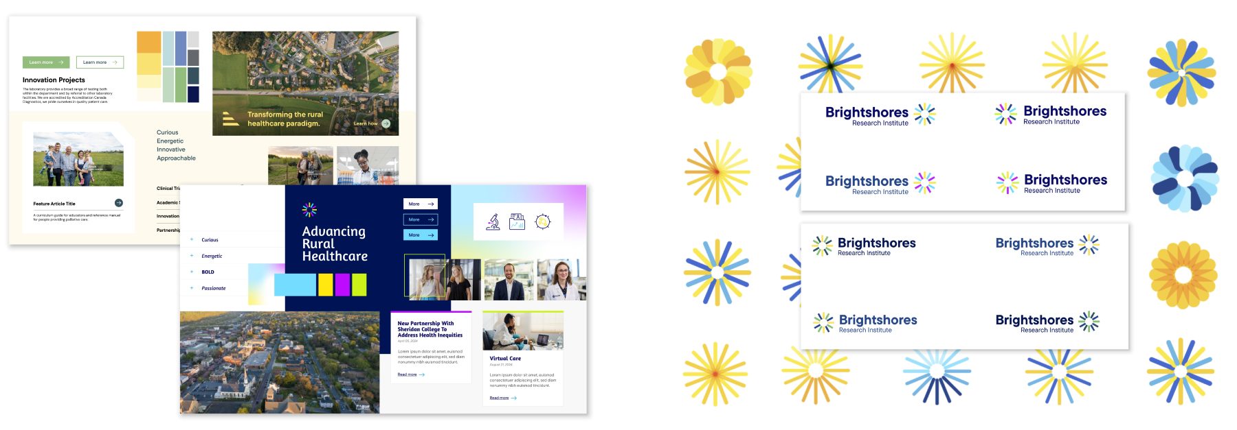
The team explored and presented various style boards, each offering a distinct visual direction for the overall look and feel of the brand. The chosen direction uses bright colours and authentic, relatable imagery to position Brightshores Research Institute as a beacon of optimism and innovation in their community and the rural health space at large. To ensure the visuals were authentic to the community they represent, imagery was sourced from a local photographer in the Grey Bruce region.
The logo design process began with hand-drawn sketches before moving to digitization, further exploration, and finally, landing upon the final selected idea.
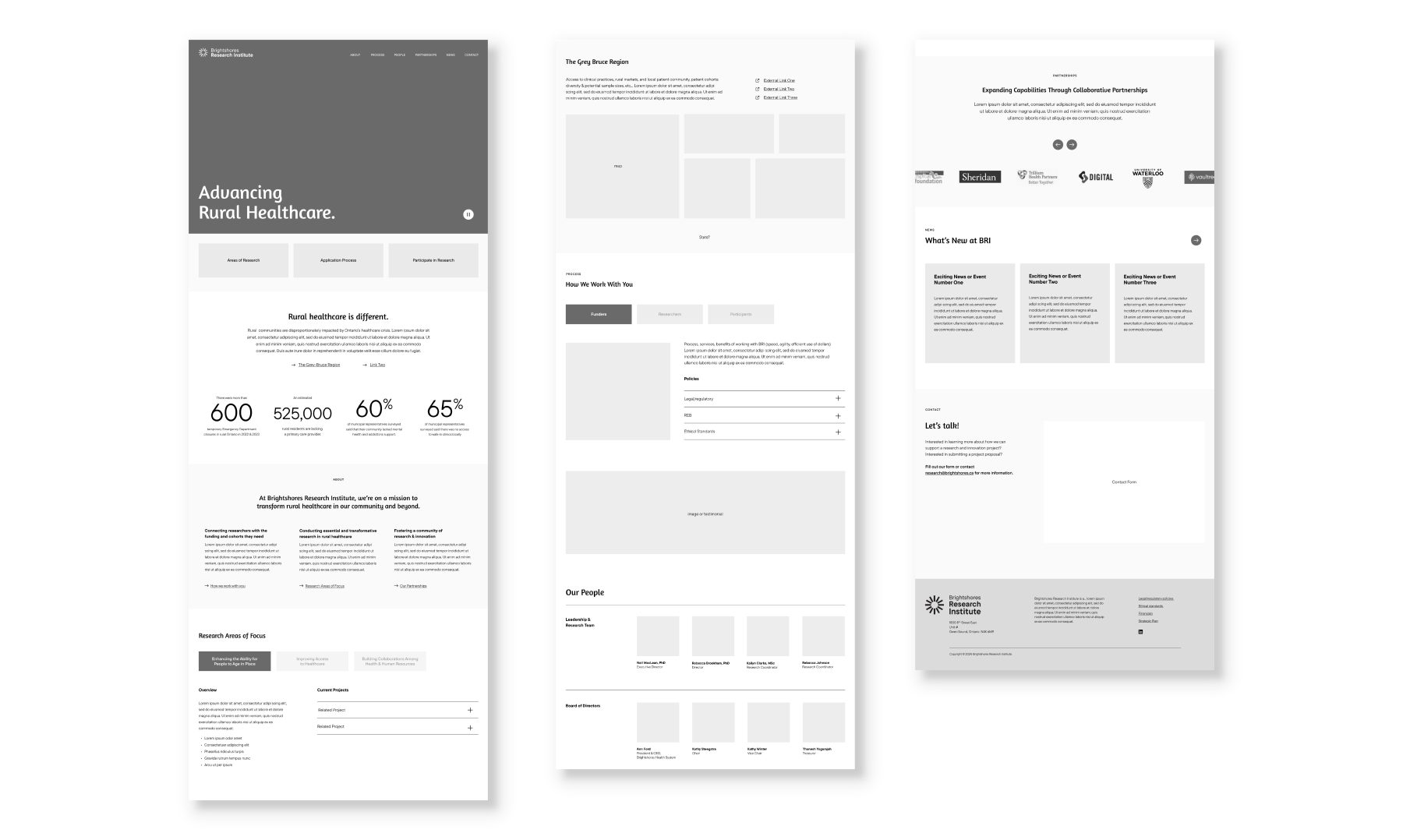
Development of the interaction design integrated user insights, needs, and organizational goals from our research phase, which helped to inform the content and hierarchy of information. The website would need to showcase existing partnerships and highlight the research, expertise, rigour, policies, procedures, and resources BRI had to offer. Visual elements were then applied upon UI approval.
Solution
A comprehensive website and branding solution positions Brightshores Research Institute as an emerging leader and innovator in rural healthcare research, clearly outlining the region’s unique healthcare challenges and how the organization’s research areas of focus will address them.
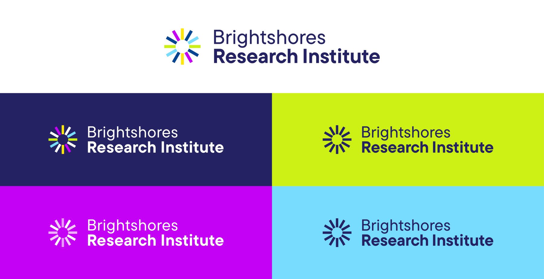
The final logo symbolizes community, partnerships and innovation; with a sunburst as a visual nod to the word "bright" in the name as well as its history within The Health System. The vibrant colour palette helps the Research Institute stand out from others in their space and conveys optimism, innovation, boldness, and approachability.
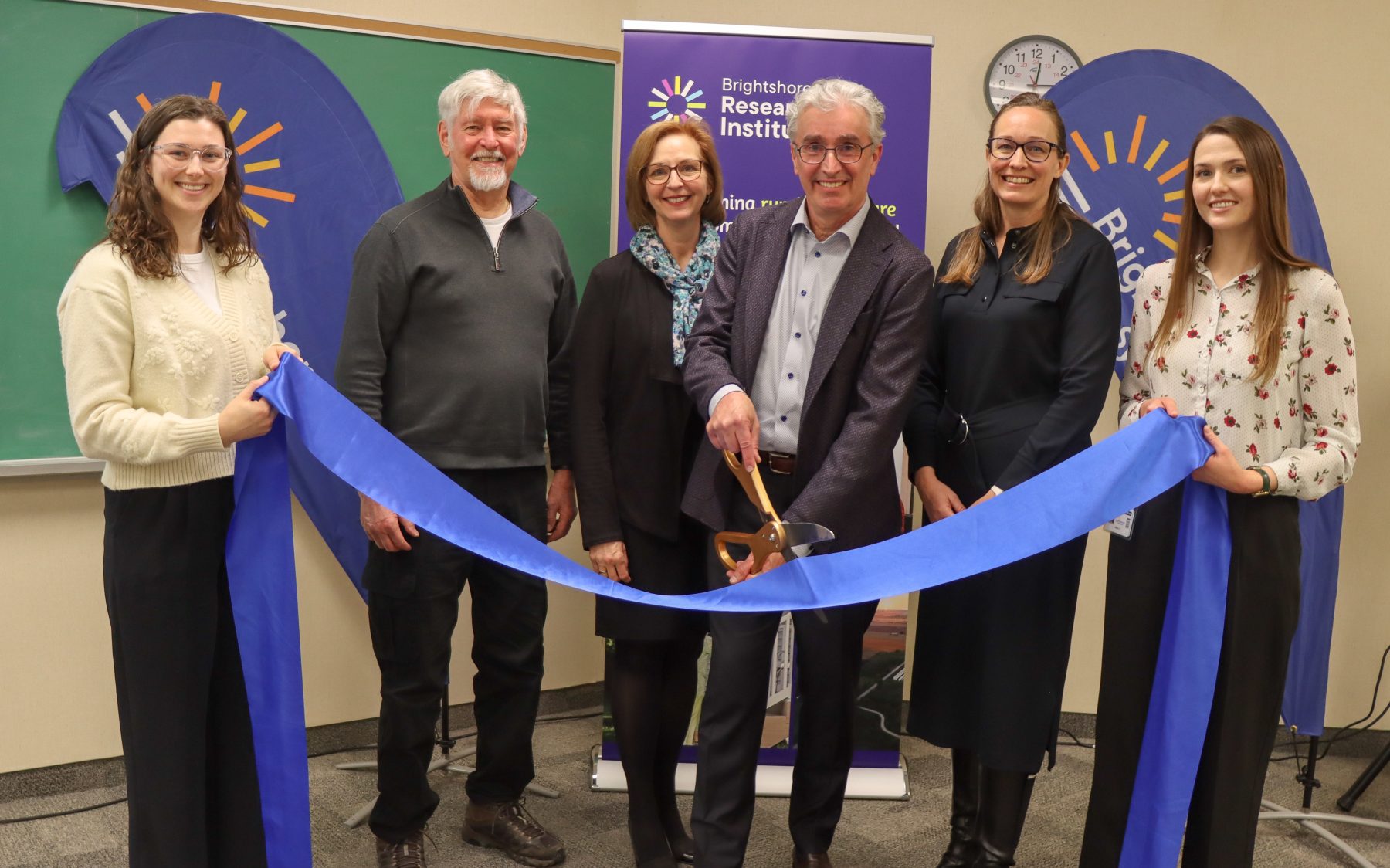
A series of communication assets were developed to support the organization's positioning through digital channels, messaging narrative, environmental applications, and conferences, and a brand guideline document was created to help the organization maintain brand consistency, applications and voice across different media.


To support the Institute's official launch, a communication strategy was organized for the event, highlighting their meaningful brand mission "to conduct essential and transformative research that improves patient outcomes, supports our healthcare workers, and promotes sustainable, community-centred care models."
More Work
View all case studies
How a service design approach revealed new ways to reach Ontario’s most underserved